Government services branding without the spin
Every machinery-of-government change produces a new logo and a dead URL. Citizens do not need a livelier state. They need the same service to keep its name long enough to be found, and a voice that can give an instruction without sounding like a campaign.
James Okonkwo, Reputation Editor · 15 April 2026 · 5 min read
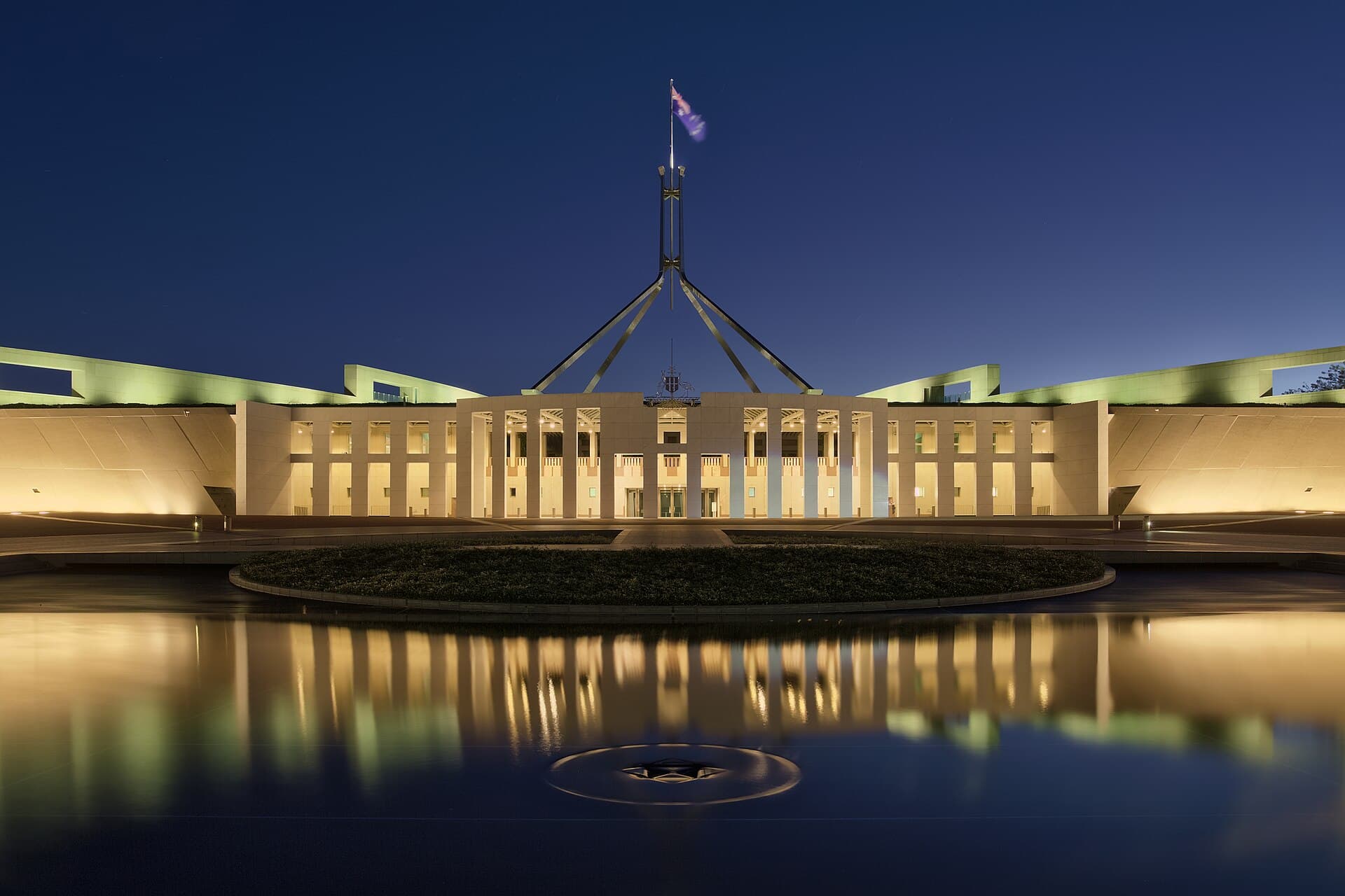
Australian governments re-cluster. Departments swallow departments. Programs are announced, renamed, absorbed, and left as fossils in a search result. Each change is an opportunity, in the minds of a certain kind of project, to “refresh the brand”. A new mark. A new teal. A new domain that will itself be redirected in three years. The citizen, who was trying to renew a thing, meets a splash page.
This is not a plea for ugly government. It is a plea for boring government on purpose. A public service brand is a civic tool. Its first virtue is continuity. Its second is clarity. Charm is optional and, in this country, quickly read as spin.
The name is a public asset
Program names are where governments waste the most trust. A plain name — a grant, a rebate, a licence — gets replaced by a title that can be launched. The launch title is harder to search, harder to say, and impossible to keep when the minister changes. Staff then use two names, the media uses a third, and the form uses a code.
Write a naming rule and put it in the style manual that already exists. Prefer the function. Prefer words already in the Act. Prefer the name a Service NSW or Service Victoria staff member can say at a counter. If a political title is required, attach it as a time-limited banner, not as the identity of the service.
Domains and logins are part of the name. Every dead URL is a citizen hour. Budget redirects as a ten-year cost, not a go-live task. If you cannot afford the decade, you cannot afford the rename.
Voice that can instruct
Government voice has improved in pockets. Plain English is no longer a radical idea. It is still optional in too many letters. The brand problem is not a lack of warmth. It is a letter that cannot tell a person what to do by Tuesday.
Write the instruction first. Then write the explanation. Then, if you must, write the sentence about the government’s commitment. Most letters should stop after the instruction. A commitment that appears above the instruction is spin, even when the policy is good.
Do not borrow start-up voice. “We’ve got you”, “your journey”, “let’s get started” on a compliance letter is a category error. The citizen is not onboarding. They are dealing with the state. Respect that by being specific.
Multilingual communication is identity, not an appendix. If a service is used by communities who do not read the English letter first, the translated letter is the brand. Fund it as such. A nice English campaign with a late PDF in one other language is a press release.
Visual systems that outlive a minister
The Australian government design systems — at Commonwealth and in several states — exist so that every agency does not invent a UI. Use them. A custom visual identity for a two-year program is how you get inaccessible colour and a contractor who owns the files.
Marks for departments should be quiet and related. The coat of arms and the word mark still do civic work that a playful monogram cannot. Save the personality for a public health campaign that has a reason to be loud, and put an end date on the loudness.
Physical places — Service centres, Medicare, courts, local libraries that have become de facto government fronts — need wayfinding more than they need a mural. See the place as the brand. A calm counter and a short queue will beat a values wall.
Shared services and the login that outlives the logo
Citizens do not experience departments. They experience a login, a myGov-shaped door, a state service centre, a letter with a reference number. Those objects are shared across brands. A department that invents a second login to express its new identity has attacked the civic system for a launch. Align with the door people already have. Put the program name inside the door, not on a new domain that will die.
Contact centres are the other shared brand. If the number on the letter still speaks as last year’s cluster, the new mark is a sticker. Record the IVR in the same week as the rename, and keep the old name as a spoken alias for a year. People will search the old name. The state should be adult enough to answer to it.
Local government has a quieter version of the same problem: a new “city brand” every mayoral cycle, while the rates notice and the bin day stay the real identity. A civic mark can be handsome. It should not require the library to reprint its wayfinding. Put the handsome mark on the things that change slowly, and leave the bin sticker alone.
Political branding and service branding are not the same
Ministers will campaign. That is their job. The service should not campaign with them. Keep ministerial livery off transactional pages. Keep the service name stable across an election if the service is stable. If the policy changed, say the policy changed. Do not hide a policy change inside a new logo. Citizens notice, and journalists are paid to notice.
Procurement should stop buying “brand strategies” for services that need a content designer and a better form. The strategy is usually: keep the name, fix the form, measure completion. That is a brand strategy. It does not need a harbour photograph.
Emergency communication is the stress test of a government identity. Fire, flood, a health order, a scam warning: the public will forgive a plain page and will not forgive a clever one that loads slowly. Keep a template that can ship in an hour, in the existing type, with the existing coat of arms, and do not use the emergency to launch a new look.
The test
Ask a person who does not work in the building to finish the top three tasks without calling. Time them. Read the words they search. Those words are the real name. If your identity does not contain them, your identity is for the launch, not for the public.
Government does not owe the public a delightful brand. It owes a state that can be found, used and survived. Design for that, and the rest is decoration — sometimes harmless, often a redirect waiting to happen.
Questions readers ask
- Should a government service have a consumer-style brand?
- It should have a durable name, a findable digital door and a voice that can instruct. It should not have a personality campaign that has to be retired at the next election or the next cluster. Citizens are not a segment. They are the public.
- What is the first job of a government identity?
- Continuity. If a person who started a form last year cannot finish it this year because the name, the URL and the login all moved, the identity has failed regardless of how the new mark looks.